Typemark and Identity
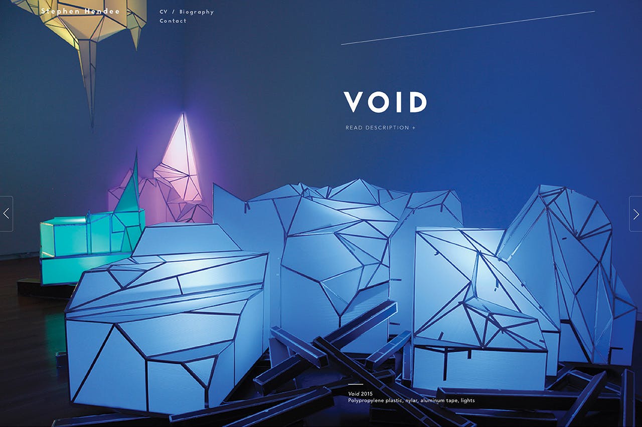
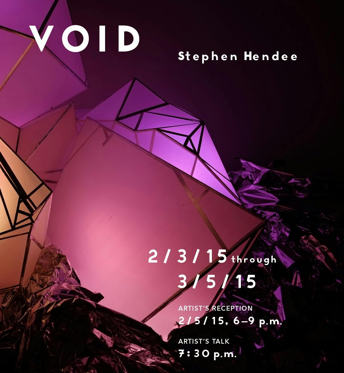
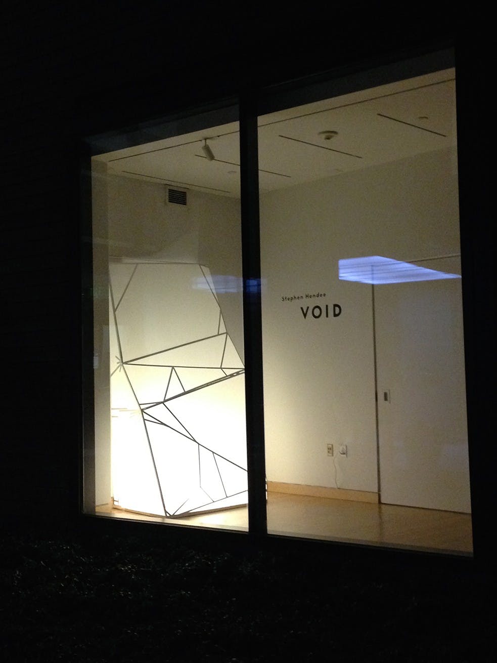
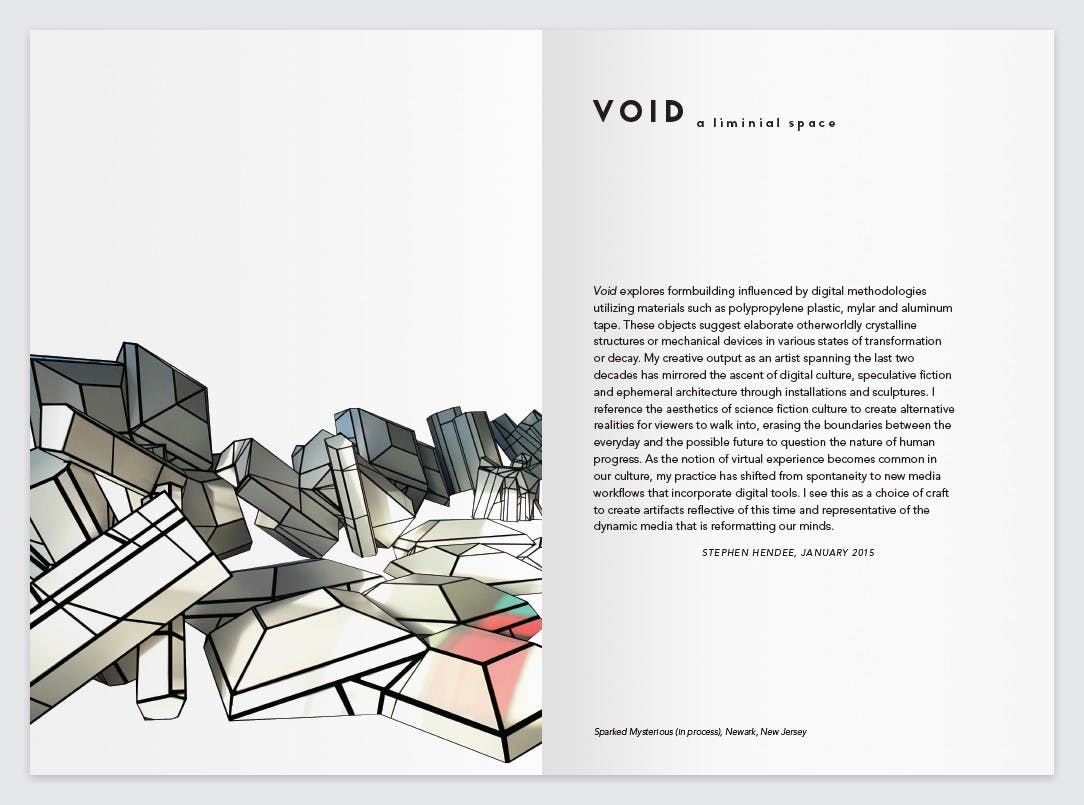
We were excited to collaborate with artist Stephen Hendee and the Silber Gallery to design a typemark and materials for the exhibition, Void. The exhibition is an installation of bold, futuristic forms made from corrugated polypropylene, metal tape, and lights. As a complement to these forms, we chose the typeface Monod because of its geometric letters and unusual proportions. Headlines and subheads for the invitations, signage and catalog were set with asymmetrical alignments.
Catalog
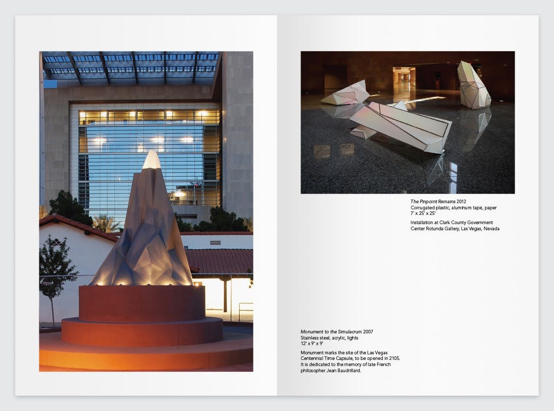
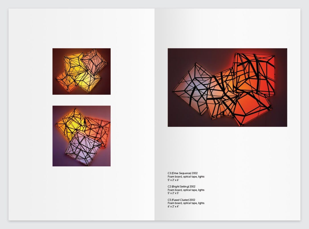
Because the installation was being created at the same time as the catalog, the challenge was to include work from Hendee’s archive that would lend context to the work being created for Void. We kept the focus on Hendee’s images and designed a simple page layout and typographic system to enhance the visual content.
Artist Website
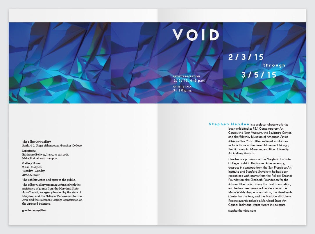
Building off the visual language established for the Void exhibit, we designed a portfolio website for Hendee’s prolific and multi-disciplinary art practice. Developed to be easy to maintain, all areas of the site are editable while new content is automatically formatted to present a unified portfolio.
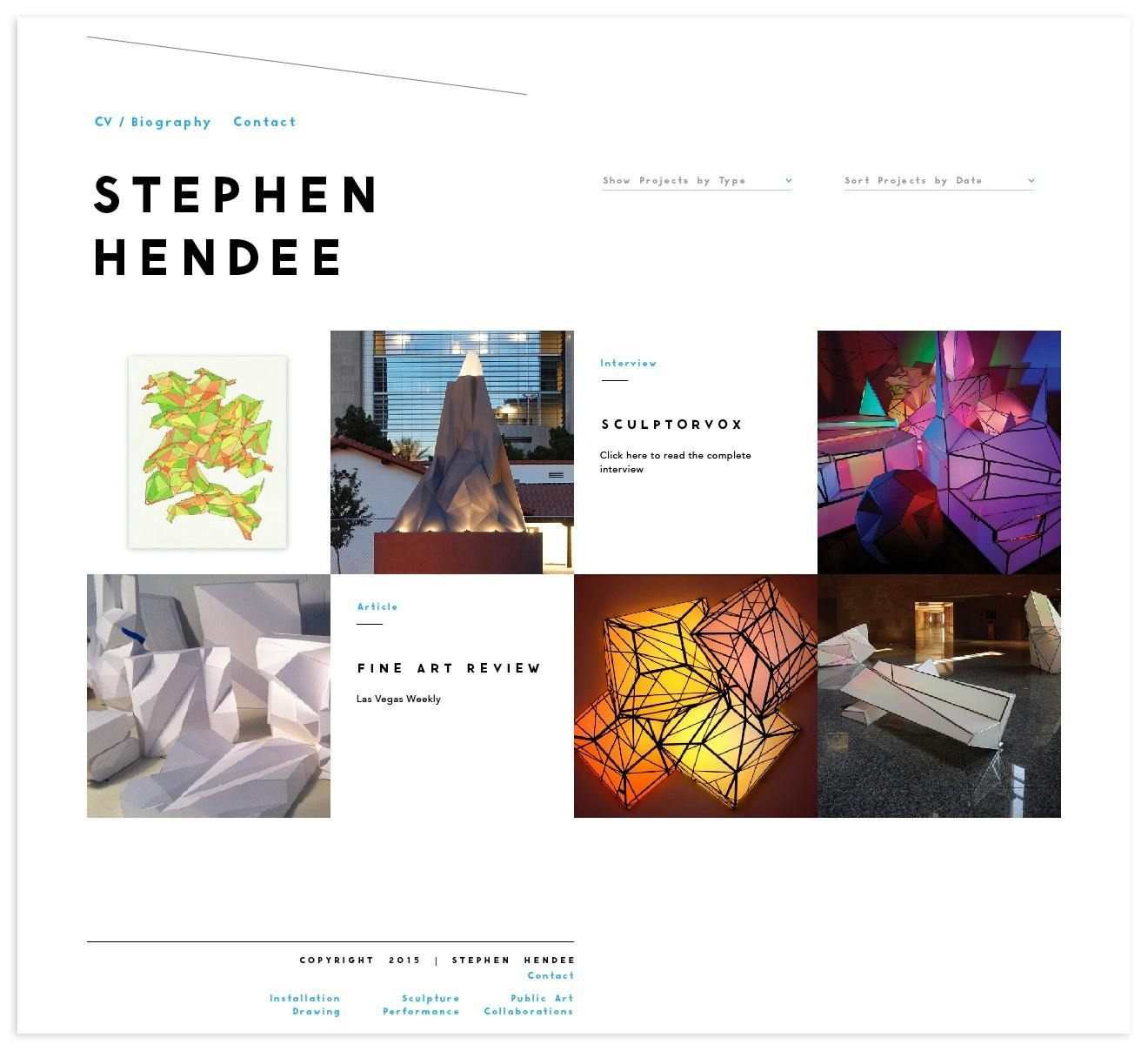
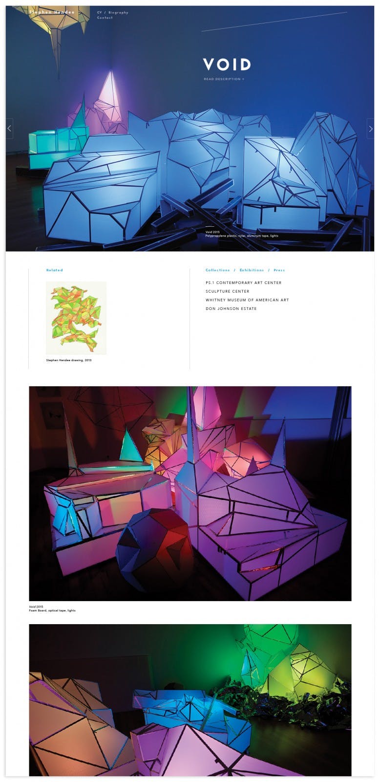
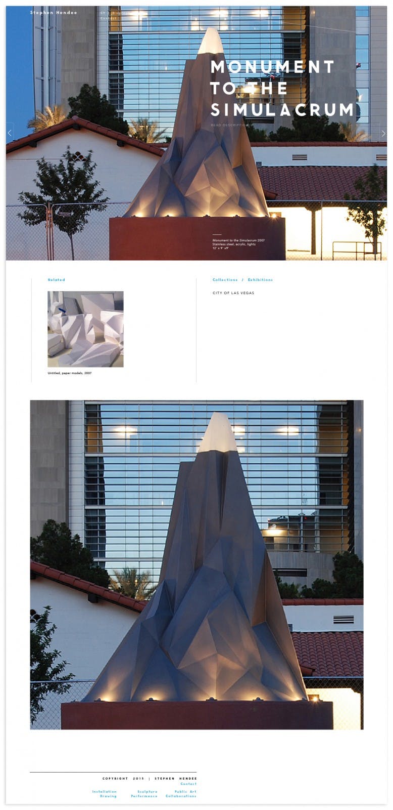
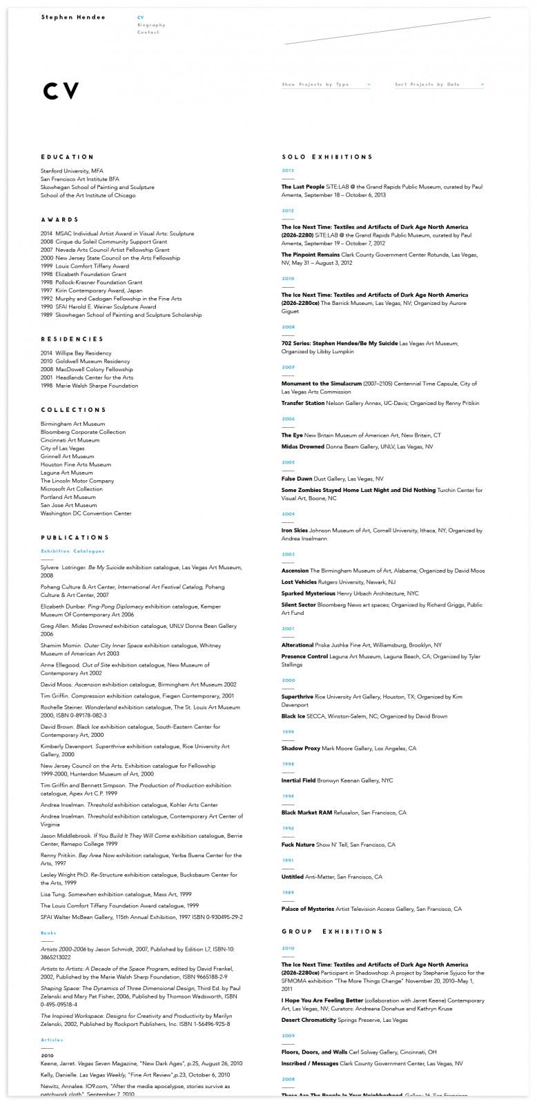
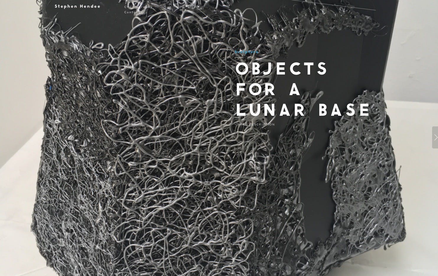
Large, immersive images dominate the website and show the materials and forms used in each series. On the title image users can choose to show or hide the descriptions of the work which come up as overlays on top of the photo. Left and right arrows allow users to easily navigate to the next series.
