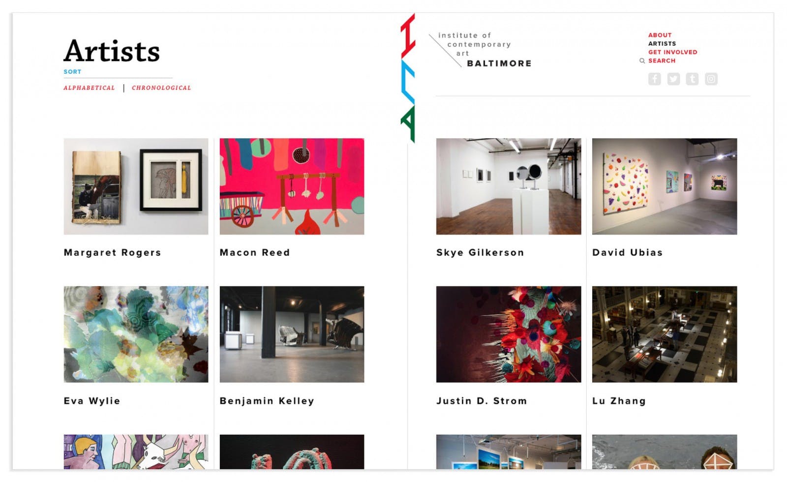
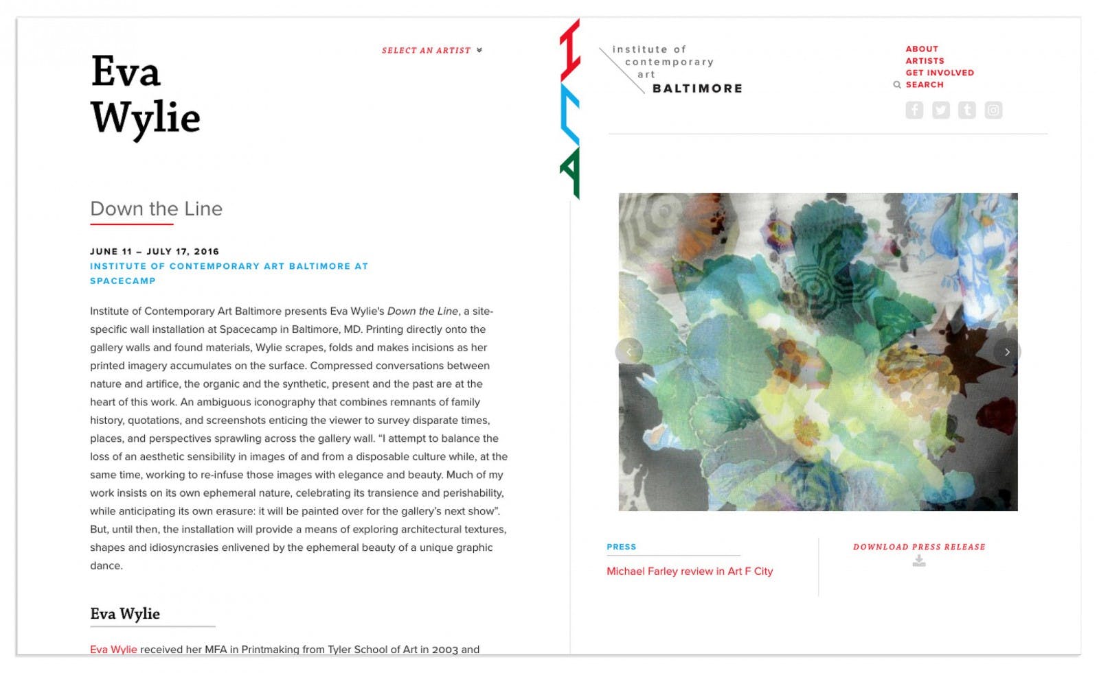
The Institute of Contemporary Art Baltimore is a non-collecting arts organization that promotes mid-career artists. When we first got involved withICA, it was nomadic. They now have a permanent gallery space in Baltimore, but also continue to work with artists in site-specific locations. As a growing organization, the ICA needed a logo, identity system and website to help them promote upcoming exhibitions in diverse physical spaces. Q Collective created a flexible identity that easily adapts to a variety of environments, and a website that promotes current and upcoming events, as well as serves as a catalog of previous shows.
Exploration
We started our design process by looking at potential combinations of the letters I, C, and A in different typefaces. We experimented with forms that are dynamic, modern and modular to represent the ICA’s mission and vision. Adding shapes, lines and patterns we explored how the letters and logo elements could be altered, repeated or changed for different applications. To further test form, we placed shapes on photographs to determine if they would remain recognizable on complex backgrounds.


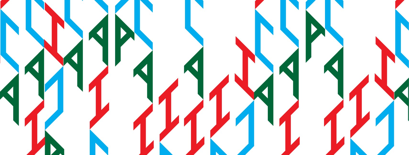
We also explored using the entire name of the organization spelled out on multiple lines to give a visual sense of movement. Repeated modules at various sizes made interesting patterns and began to suggest ways the identity might be used as signage, wallpaper or other graphics for both online and physical spaces.

Because ICA is a common acronym, our client suggested that we try some identity options that emphasized the wordBaltimore.

Synthesis
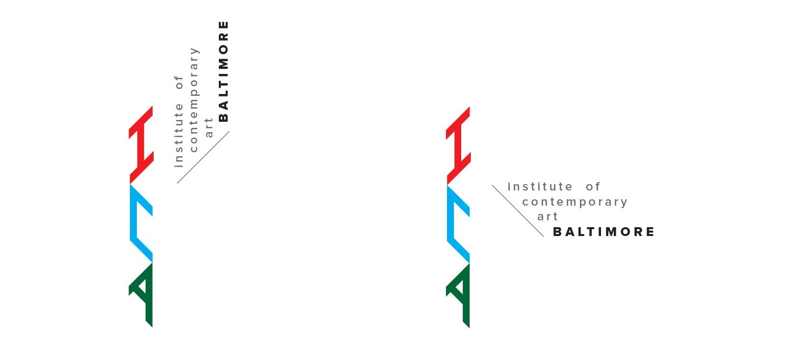
Ultimately, the client decided on a lettermark featuring just the letters I,C and A placed on an angled grid. The geometric letters are modular and can be placed in multiple configurations, made into patterns, and used with different typography lockups that show the organization’s entire name. The mark is a refined version of an early logo that was used on press releases and business cards. We redrew the mark, making changes to proportion and weight, to assure it would be legible in print and onscreen at a variety of sizes – everything from a website fav icon to a giant banner.
To complement the lettermark, we tried various sans serif typefaces for the secondary typography.From left to right; Futura, Apercu, Galaxie Polaris, Larsseit, Monod and Proxima Nova. Proxima Nova, with its open characters was chosen for its high legibility and modern aesthetic.

Website
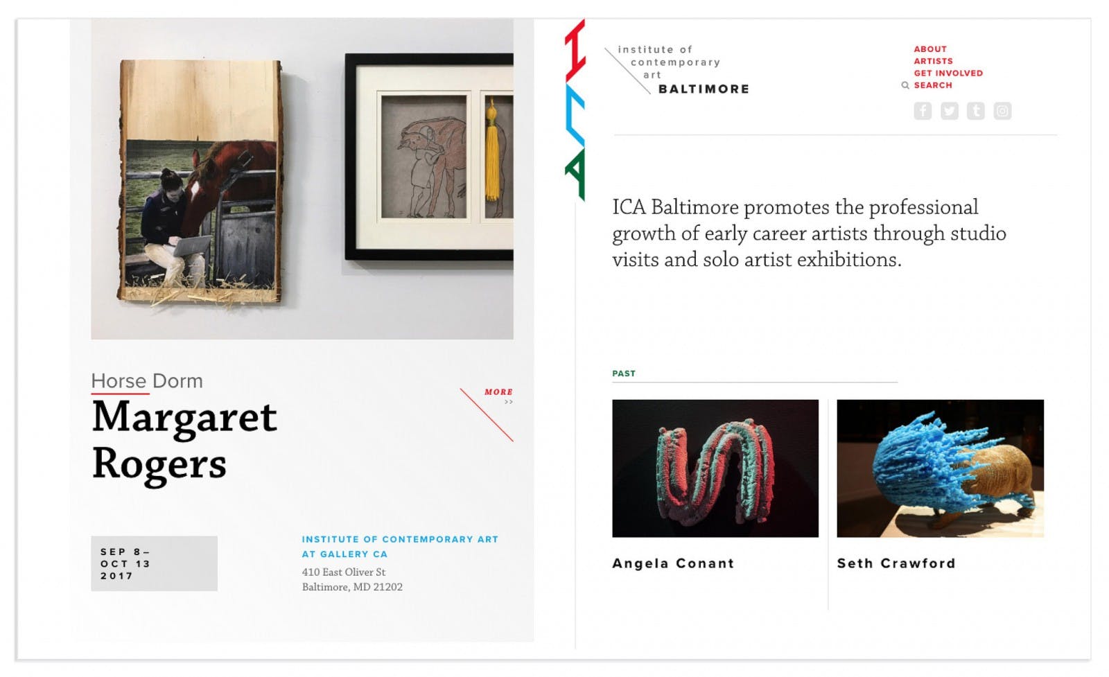
Our goal for the website was to showcase the artists’ work while providing pertinent information about events and exhibitions. As a non-profit run by volunteers, ICA wanted an easy-to-update site that could also serve as an archive of past shows. For the home page, we focused on the idea of posters as a way to promote openings and exhibitions. This idea drove the design concept of a split screen, using each side to highlight exhibitions with an image, artist’s name and dates. We tried an option where the left and right sides were both poster-like, but ultimately decided that it was important to give more prominence to the current exhibition on the left. The right side of the screen features navigation and small images of past exhibitions.
For the mobile site, we designed a one-column layout, with global navigation at the top, followed by the current exhibition, ICA’s mission statement and images from past exhibitions.
